2025
Designing an app for exclusivity
Responsibilities
UI Design
UX Research
Platforms
iOS
Android

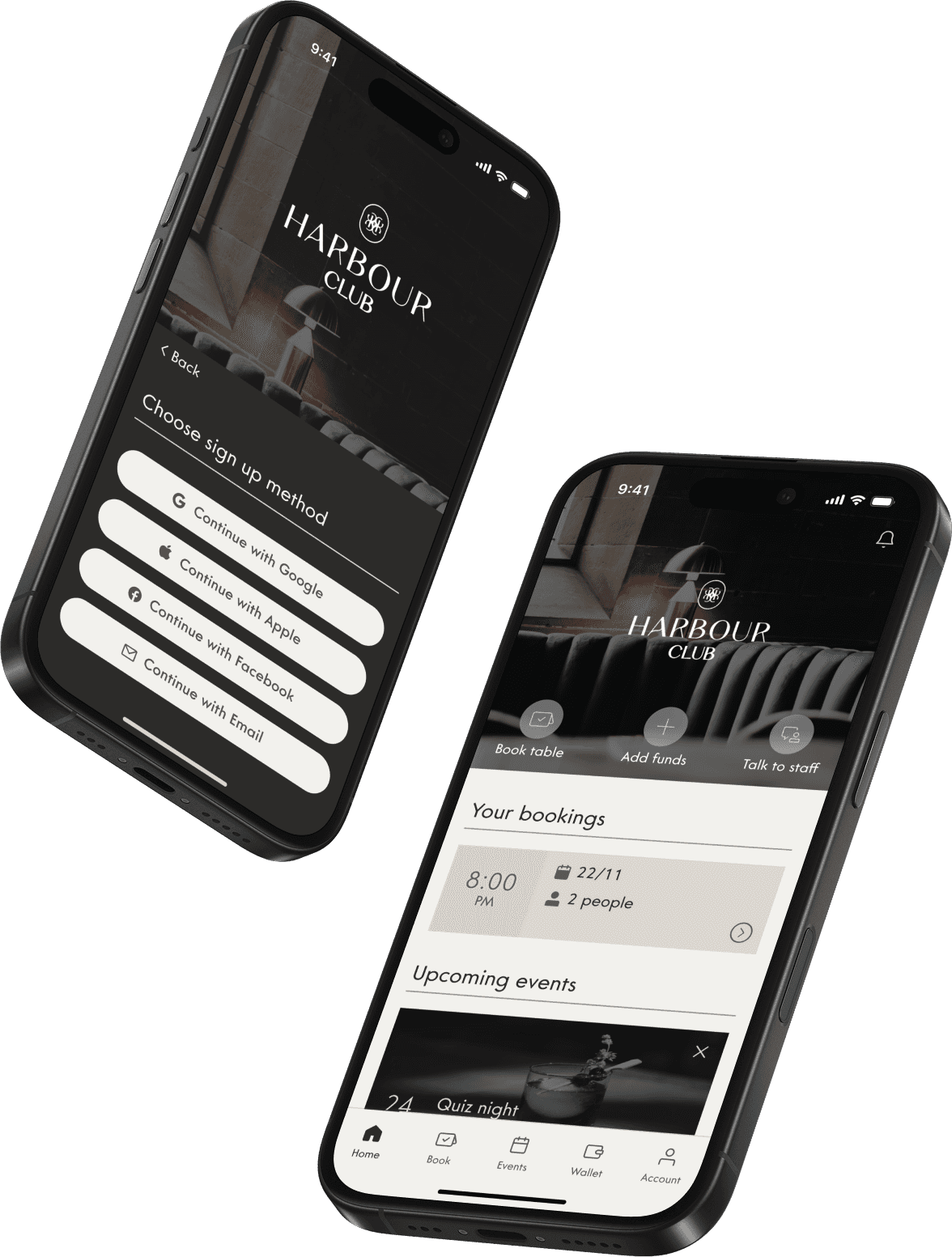
The Harbour Club is the first members-only lounge club in Antigua. This project consisted of designing the club’s app with two distinct versions:
Member’s view
Allowed users to book tables, check events, view billing history, and more
Staff’s view
Enabled staff to manage bookings, events, notifications, staff members, and menu offerings
The challenge was to craft a seamless experience that reflected exclusivity and luxury while being highly functional for both members and staff.
For the sake of the length of this case study, I will be focusing on the member’s view of the app.
1. The process
Planning the design approach
When planning the approach to design this app, I had to take into consideration that I would not be able to iterate after handoff and therefore it was imperative that I got it right the first time. This usually translates into investing more on research. However, the client wanted the app to go live as soon as possible. Therefore, I decided to create a balanced approach that contained only the stages necessary to create a well-rounded app, but without skipping on the foundations that would allow me to understand the user.
2. Research
Empathizing through a negative print
There was no research available online about the demographic that was hypothesized to want to attend this club, and doing primary research was also not an option due to the difficulty of reaching out to these high-value individuals. As a result, I decided to take a different approach: The best members-only clubs from around the world were researched and cross-referenced with regular lounge clubs in Antigua (since there are no members-only clubs there yet).
Through that analysis, a persona was formulated based on who those clubs were trying to cater to, what needs were trying to be met, and what pain-points were trying to be addressed. Meet James Francis, the high-value local:

From there, it’s possible to envision the user’s behavior. By cross-referencing that with the services the Harbour Club wanted to provide, I mapped out some key user flows (like the one showed below), and created a feature list.

Finally, in order to start designing a UI, I made a moodboard with screens of the websites and apps of the previously analyzed clubs in order to identify trends in design language.
In regards to testing, 5 moderated usability tests were done once the prototype was ready. The testing methodology was pretty straight-forward — Put the prototype in front of the user and ask them to complete 3 tasks while I watched:
Cancel booked table
#1
Cancel event attendance
#2
Remove credit card from account
#3
These tasks were chosen because they are the most complex user flows within the app, meaning that if the user is capable to completing them, they are very likely to be able to complete any task in the app without a problem.
In the end, the results of the tests were very positive. All the users were able to complete the tasks without a problem, and only reported having an issue with a small detail which was promptly fixed.
3. Ideation
Understanding the user
At this stage, I started by making paper wireframes for the main user flows to serve as guidance for when designing on Figma. Since they were made for the purpose of exploring and documenting ideas, they didn’t need to be too detailed or refined.


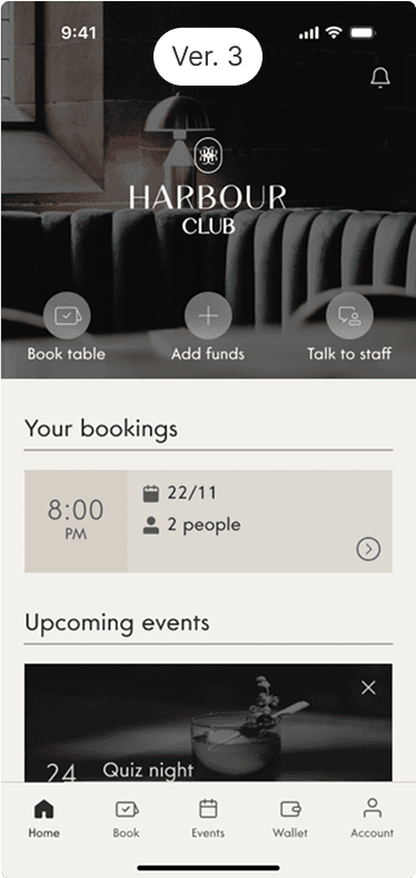
As you can see above, one of my design decisions in terms of user experience was to add 3 quick action buttons right around the beginning. I did this because I believe the 3 actions associated with those buttons constitute 70% of the reasons as to why the user would open the app, and for high-value individuals that expect services and products to work quickly and effortlessly, this emphasis on functionality felt like an adequate choice.
Once I had a vision regarding the user experience of the app, I set out to establish a visual design language. To do so, I decided to first design the homescreen and iterate upon it several times before moving on to the rest of the app. The main design trends that were identified on the other clubs' websites and apps were minimalism with sharp corners and large images depicting a luxurious lifestyle.


So I decided to follow a similar direction, but adapted these principles to reflect the club's aesthetics as well as Antiguan values.


Once that was established and approved by the client, the rest of the app was designed.
As for the motion design, it was imperative that this was spot on since I believe that luxury is conveyed by fleshed out details that don't insist on capturing the user's attention. Following this philosophy, I decided that the animations for the onboarding flow could be more elaborate for an initial "WOW" moment, but post-onboarding animations needed to be more subtle - Something that is unobtrusive, but showed these details were taken into account.
4. Documentation
Ensuring a faithful implementation
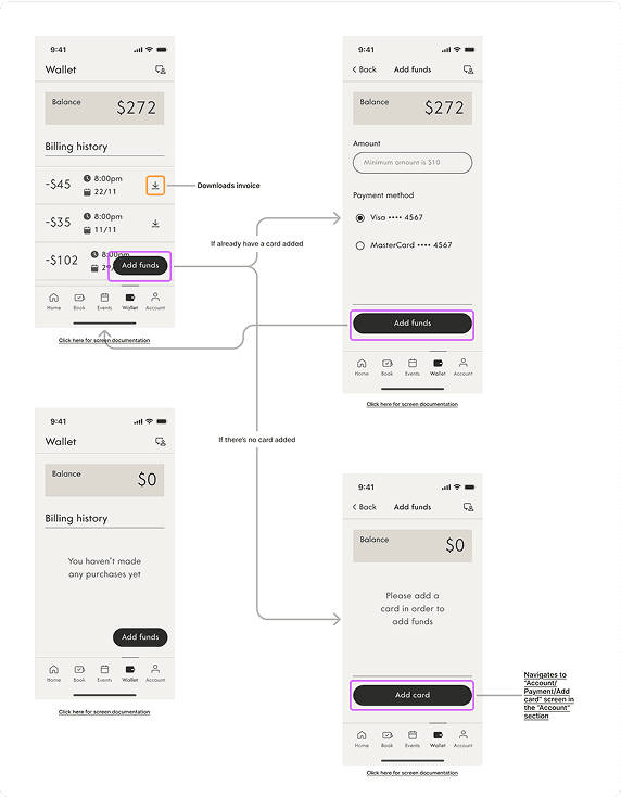
I was not aware of the level of experience of the developer that would be coding the app, so I wanted to make sure that I could provide as much support as possible through documentation. Therefore, I decided that the handoff documentation should consist of three parts: The wireflow that had all possible interactions mapped out, the spec sheets with all the information necessary to code, and an asset library for easy download of high quality assets.

5. Results
An exclusive app made for functionality
Get in touch
+351914084854
zemariaacampos@gmail.com