2023

Redesigning Reddit

Responsibilities

UI Design

Heuristic Evaluation

Icon Design

Platforms

iOS

Android

2023

Redesigning Reddit

Responsibilities

UI Design

Heuristic Evaluation

Icon Design

Platforms

iOS

Android

Reddit as been around for a long time, and a lot of user have stuck with it since its early days. However, if you ask a new user for their thoughts, chances are that they’ll mention the cluttered UI and the confusing subreddit system. Even amongst the heavy Reddit community, the UI and some other poorly optimized features have become an inside joke of sorts.

Project scope

  • Audit Reddit android app

  • Redesign 3 screens

Constraints

  • The time frame to complete this project was two weeks

  • Insights gathered through a heuristic evaluation instead of user research

This case study was completed on April of 2023. Having accumulated a lot of experience since then, I’ll will be leaving a few comments throughout this case study briefly giving my opinion when looking back.

1. The problem

Non-user centered design

The main problem seems to be that Reddit is designing its app around how they want users to behave instead of designing the app around how the users actually behave. Therefore, I concluded through a heuristic evaluation that Reddit users need a more intuitive and decluttered interface, because these shortcomings serve as a barrier of entry for new users and as friction to the heavy users’ experience.

2. Heuristic evaluation

Pin-pointing pain-points

The main problem seems to be that Reddit is designing its app around how they want users to behave instead of designing the app around how the users actually behave. Therefore, I concluded through a heuristic evaluation that Reddit users need a more intuitive and decluttered interface, because these shortcomings serve as a barrier of entry for new users and as friction to the heavy users’ experience.

Usability heuristic broken:

Flexibility and efficiency of use

The header bar doesn’t allow the user to filter the homepage or access r/All directly. It doesn’t provide direct access to the navigation categories that users usually guide themselves with.

Usability heuristic broken:

Aesthetic and minimalist design

The post header takes too much attention away from the post. The subreddit and username of the poster can be relevant information to the user, but it is not more relevant than the post itself and therefore, aside from the title, it shouldn’t be at the top of the visual hierarchy.

Usability heuristic broken:

Aesthetic and minimalist design
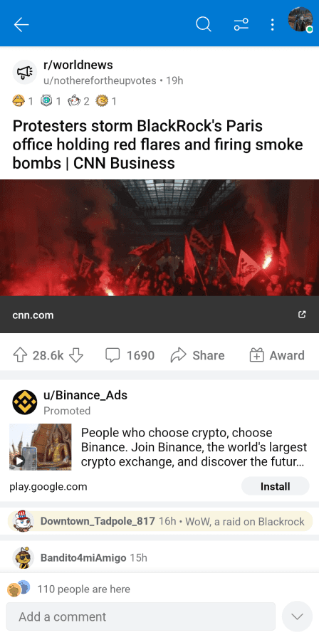
The post’s information should only be there to remind the user of what the comment section is referring to. When the user clicks on the comment section button, they most likely have already seen the post and are only interested in seeing the comments. This, combined with the advertisement, makes it so the user has to scroll an entire screen before being able to see the comment section.

Usability heuristic broken:

Aesthetic and minimalist design

Too many dividers used. Screen feels cluttered and claustrophobic. The usual solution to this is to separate with space rather than lines.

Usability heuristic broken:

Flexibility and efficiency of use
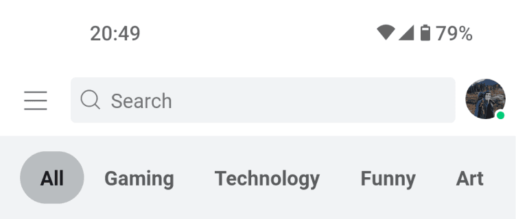
There’s no text based content in the Discover page when a lot of Reddit’s content is purely text based. It could be stories, questions, rants, among others. By not being able for users to discover these posts, Reddit is pretty much cutting in half the amount of discoverable content.

Usability heuristic broken:

Aesthetic and minimalist design
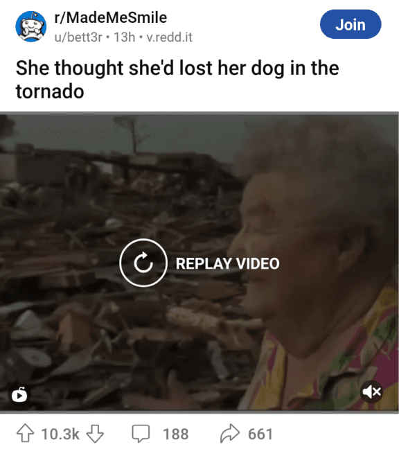
The number of upvotes is not high enough in the visual hierarchy. The number of upvotes is the metric by which most users guide themselves on Reddit. It is both a measure of reliability of information and popularity. Therefore, it is often one of the first pieces of information that a user will look at, sometimes being even used to subconsciously decide if the user will want to see the post or not.

3. Ideation

Designing Reddit for Redditors

I wanted the app to have a rounded, flat design. Reddit has a lot of information constantly jumping at the user, and most times hiding that information isn’t an option. So in order to make the consumption of that information less intimidating, I thought it appropriate to use a friendly design with space to breathe.

I started out with some sketches and made some notes on how to address the pain-points of the current Reddit app. Normally, I would have drawn them better, but since this was a solo project, I didn’t feel it was valuable to do so since no one else would use them as reference.

Once I had the general direction I wanted to follow, I started working on the foundational elements of the design: The atoms. This included color, typography, and corner radii.

#4B3A5B

#D4724E

#40B1B3

#222222

#797B7D

#E9EBED

In regards to color, I decided to go with a muted purple to contrast with the neutral colors used in the rest of the app. It should give off a sense of creativity and fun without taking too much attention away from the posts. Using this hue as a reference point, I played around with colors and decided on a split complementary color scheme for the accent colors.

If were to redo this project now, I would use more subtle colors. The purple ends up being to contrasting with the rest of the app, not to mention that this tone can be a polarizing color in terms of visual taste. If I were to still use the same hue, I would then decrease the saturation and brightness significantly.

See more

As for the corner radius, I went with 30px for most elements with the exception of very large elements, which had a 60px radius.
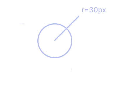
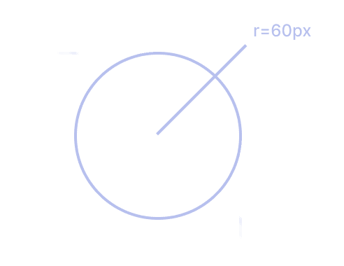
At the time, I wasn’t really familiarized with working with bases and multipliers so I just used what “felt right”. Looking back, even if I wanted an extremely rounded look, I should’ve have used a smaller radius for most elements, as well as have assigned different radii for differently sized components.

See more

4. Iconography

Making a new icon set

Between the 3 screens I chose to redesign, I found 16 distinct icons that were used. Since this was a relatively small amount, I decided to redesign them from scratch to match the rest of the redesign’s visually identity.

I remember being so proud when I finished these. Looking back, I could have done worse, however, there’s a few glaring issues: I when I first designed them, I didn’t take into account the dimensions of the elements in which they would be used, so when I tried placing them in the wireframes and noticed they were too big, I would try to scale them instead only to realize that the line thickness would decrease significantly. This is why you see some icons with disproportionate thicknesses compared to the rest - I was trying to compensate, but did so without any grid/size system. It was then I understood why a lot of icon sets provide different versions for different sizes instead of just scaling them.

See more

5. Results

A new browsing experience

There’s a lot of things in this project I would change knowing what I now know. However, this was the first project that I felt confident enough in to create a case study for, and the fact that I’m able to look back and disagree with my former self, is not only an important trait for a designer to have, but also a sign of growth I believe.

See more

Get in touch

+351914084854

zemariaacampos@gmail.com